Saturday, March 08, 2008
And the new name for Rik's poetry website is ...
The RikVerse website
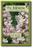
Snazzy, huh?!? It ties in with the poetry book thingy - marketing and stuff.
Anyways, I've redesigned the poetry website. In the end I decided that simple was best, so wordage has been cut down as far as possible. I also radically redesigned the navigation and made access to the poetry - which is what the website is supposed to be about, yes? - more immediate.
The look'n'feel is distinctly minimalistic and uncluttered with a nice, large, open and well-spaced fontsize to make people feel right at home, and the poems easier to read. Images have gone - there's only three static images on the whole site. Who needs images anyway?
Even so, this isn't a simplistic recoding: there's plenty of little bits'n'pieces of backroom stuff to make it feel a little more, well, sophisticated; for instance video and audio feeds are now embedded into the page but only appear when the visitor requests them - check out the Judgement poem for an example of both, and while you're there have a play with the navigation pane.
Most importantly, of course: Enjoy!
Subscribe to:
Post Comments (Atom)


Neat navigation system.
ReplyDelete