(I'm going for stylish/professional - yeah, har har Rik).
Attempt 1:
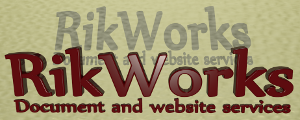
Attempt 2:

Attempt 3:

Attempt 4:

Attempt 5:

Either one of you are welcome to respond. Answers in a comment, please.


The RikVerse
The RikVerse website is a living book of poems, regularly revised and updated with new work as the muse I ride sees fit
22 Facets of my Father
A set of poems loosely inspired by the Major Arcana tarot cards, investigating the relationship between a father and a son.
hardcopy: £2.49 + p&p
Play Time
These 22 poems are some of my earlier work, from the poems that survived the post-puberty bonfire up to around the turn of the century.
hardcopy: £2.49 + p&p
From Each Skull, A Story
None of the people described in these poems are real – they've all emerged fully formed from my imagination. Feel free to draw whatever conclusions you like from this admission.
hardcopy: £1.99 + p&p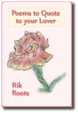
Poems to Quote to your Lover
In this collection, I am proud to present you with some love. These poems deal with loves and relationships in all their wonderful and woeful manifestations.
hardcopy: £1.99 + p&p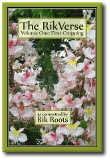
The RikVerse: volume 1
Includes all four of the above chapbooks, at half the price!
hardcopy: £4.99 + p&p
The RikVerse Website
The Kalieda Encyclopaedia
The Rikweb forum
Rik's Issuu page

![]()

I like number 5, the last one. I think with the busy font you've got, the simple the better. Looks good =)
ReplyDeleteHi, Keri, and welcome. Congrats on the progress made with Talajyn - it's looking very nice.
ReplyDelete#5 is by far the best of this sorry bunch. It's #4 with a 1px gaussian blur used to de-roughen it.
The font's nyala. Not convinced nyala is the right font to use here. The logo itself is a blender object, so it'll be no problem to change the font. Which one to choose, though ... maybe I'll change the material, too ...
Thanks =) I actually really like the font. It's very distinctive and individual. Personally I would adjust the kerning a bit- the space between the "Ri" and the "Wo" are very different. Maybe move the "orks" closer to the "W" and play around a bit with that. Other than that, I really like it. I like how the lines align to the same width, too.
ReplyDelete